.avif)
.png)
If you’re working with marketing data, you know how important it is to present it in a way that’s clear and impactful. What if we told you that you can now generate stunning visuals based on your data and display them on a webpage without needing to learn how to design and code? Manus helps you turn your numbers into polished, professional visuals without spending hours in design tools.
With just a couple of prompts, you can generate data visuals, put them on a webpage, and share them with your boss, your coworkers, or anyone who wants to see the data in a visual form.
This tutorial guides you on how to access the visualization tool, upload data sheets, write a prompt to convert the data into stunning visuals, and publish everything on a webpage. So let’s get started.
In this tutorial, we’ll show you how to:
- Access Visualization in Manus
- Upload data sheets and other documents
- Transform the data into visuals
- Publish your visuals on a webpage
Let’s get into it right away!
Step 1 - Access Visualization in Manus
Before accessing Manus, it is important to have at least 500 credits. A new account comes with a thousand credits. So if you have a new account, you are golden!
Visit Manus and log in to an account.
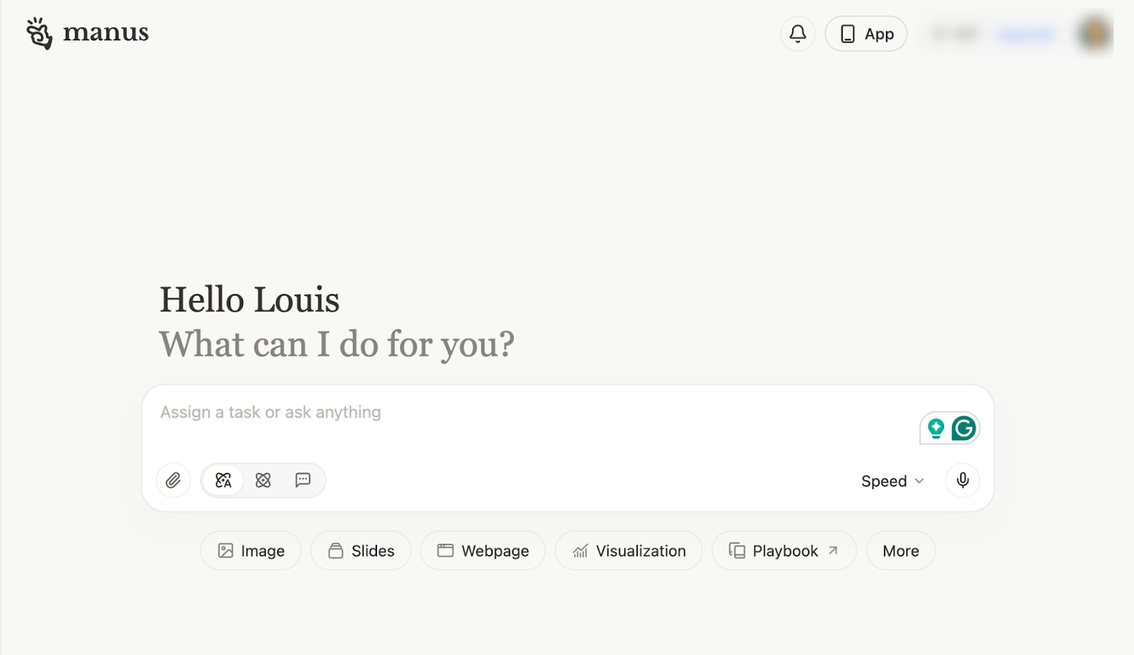
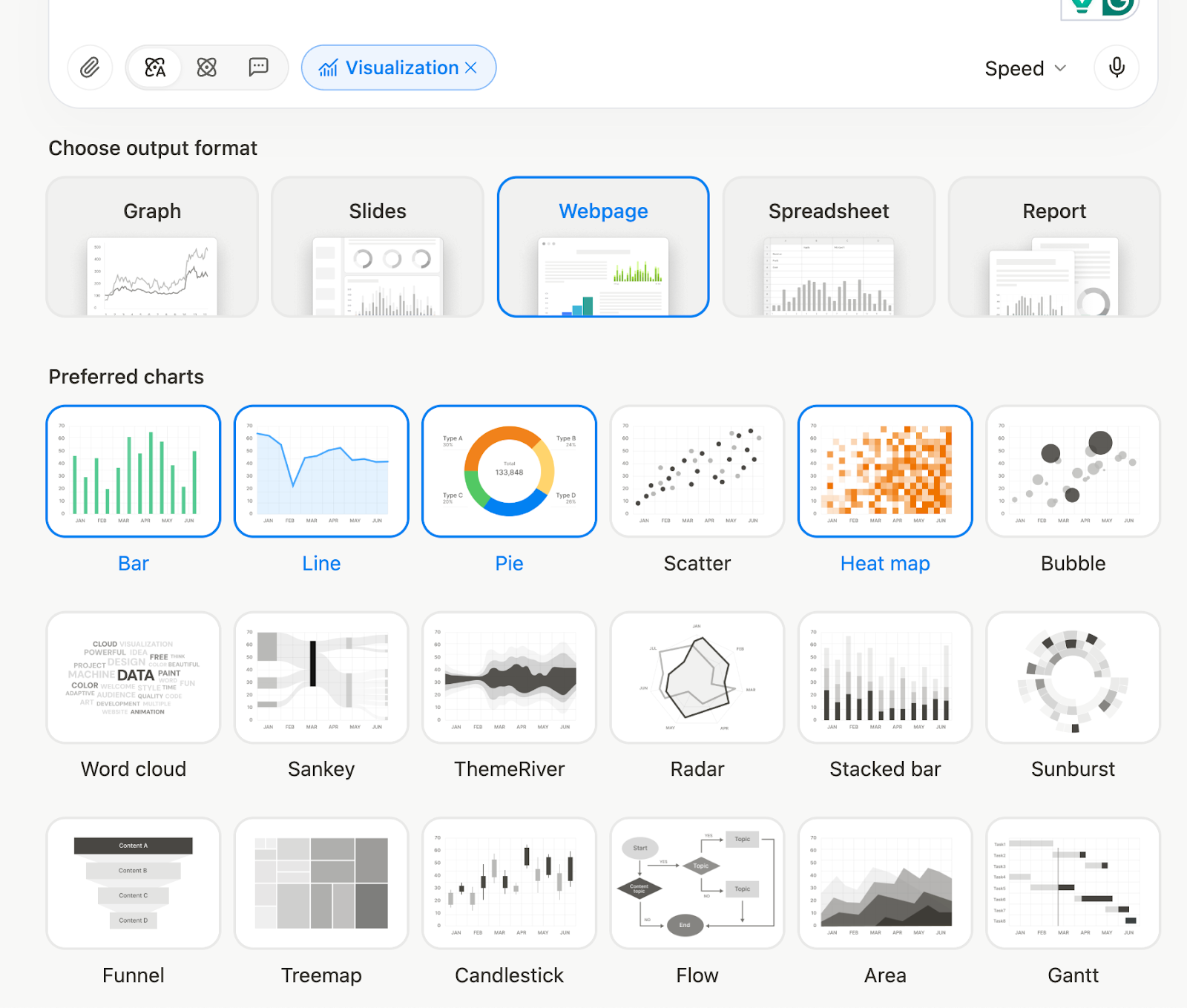
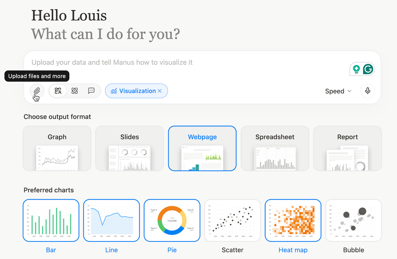
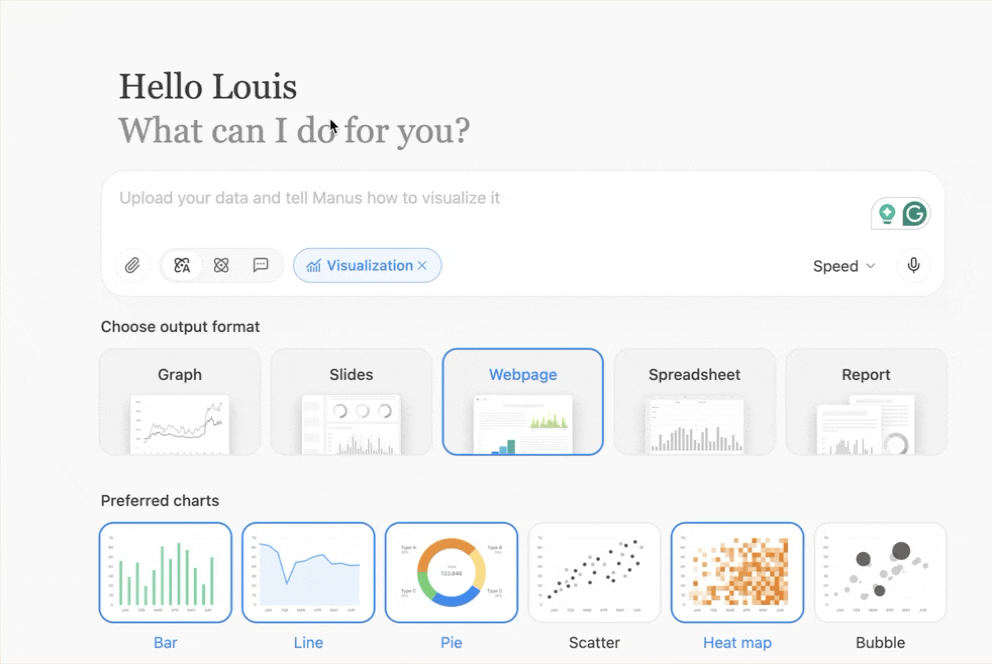
Choose the ‘Visualization’ link right below the chatbox.
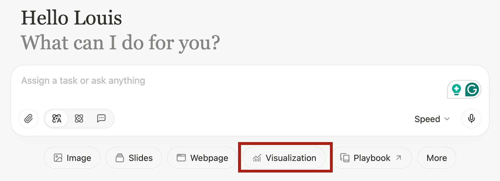
A visualization tag will be activated in your chat.
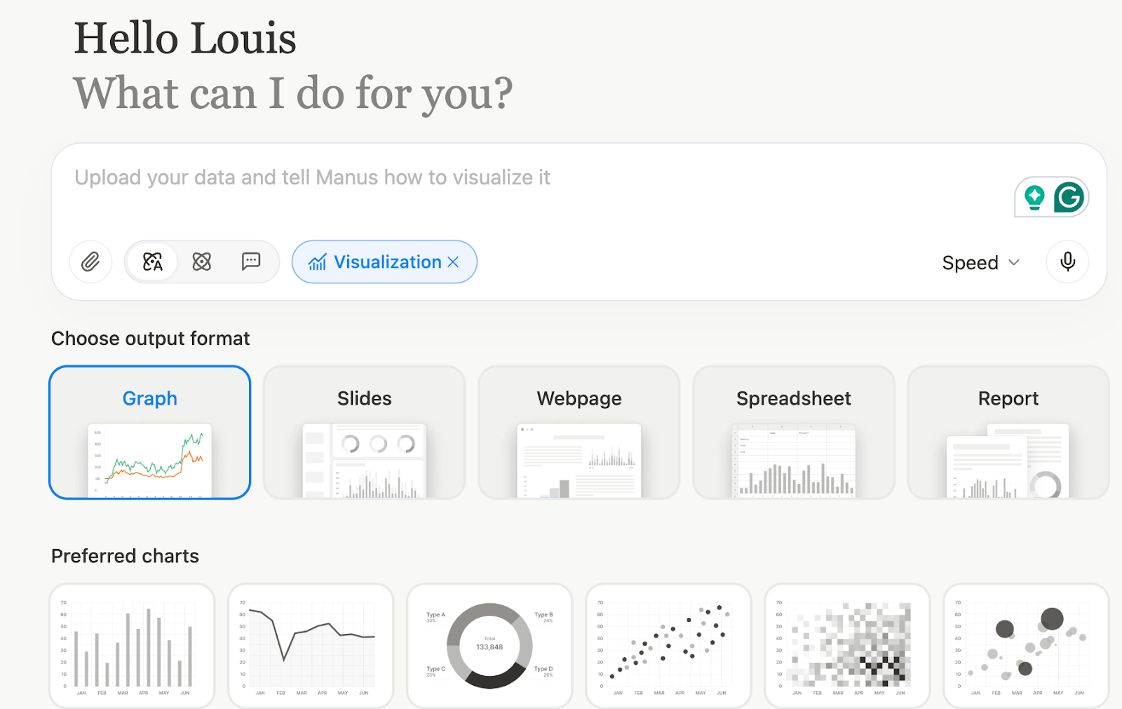
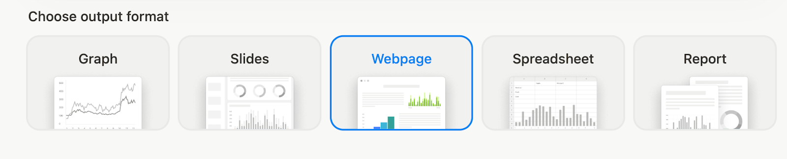
Next, choose ‘webpage’ as the output format.
Select the type of visuals for your marketing expenditures report. For marketing expenditures, a bar chart, a line chart, or a pie chart is helpful. It helps understand the data and provides a quick overview of the spend data.
Step 2 - Upload data sheets and other documents
Now comes an important part. Upload data sheets, documents, and anything that shows marketing expenditures. It can be yearly data or half-yearly reports. Do not worry about sanitizing data or making sense of it. Manus will do it for you! Save your time and just upload the documents.
Click that tiny paperclip icon in the chatbox.
Upload your documents by selecting the relevant ones on your computer. You can also import documents from Google Drive and Microsoft OneDrive.
Step 3 - Transform the data into visuals
Now, to generate visualizations, craft a prompt to create visuals from the data you uploaded. The prompt should provide details on what to do with the data, how to visualize it, and how to make a report from it.
Use the following prompt as guidance. Modify it to suit your needs or the type of visualizations you require from your data.
Prompt:
Please clean up the marketing-spend table (remove any blanks, standardize every figure to whole euros, and double-check that the subtotals add up to the €100 000 grand total), then turn the numbers into a crisp pie chart for the online-versus-offline split, a stacked bar showing each channel’s annual outlay, and a multi-series line chart tracking monthly spend per channel. Once the visuals are ready, lay out a concise executive report—no more than 350 words—with headline insights, the three biggest cost drivers, the months with peak expenditure, and two practical recommendations for improving ROI, all formatted in bullet points and clearly captioned so it can drop straight into a C-level slide deck. Start by displaying the sanitized data table, follow by the charts, and finish with the written summary.
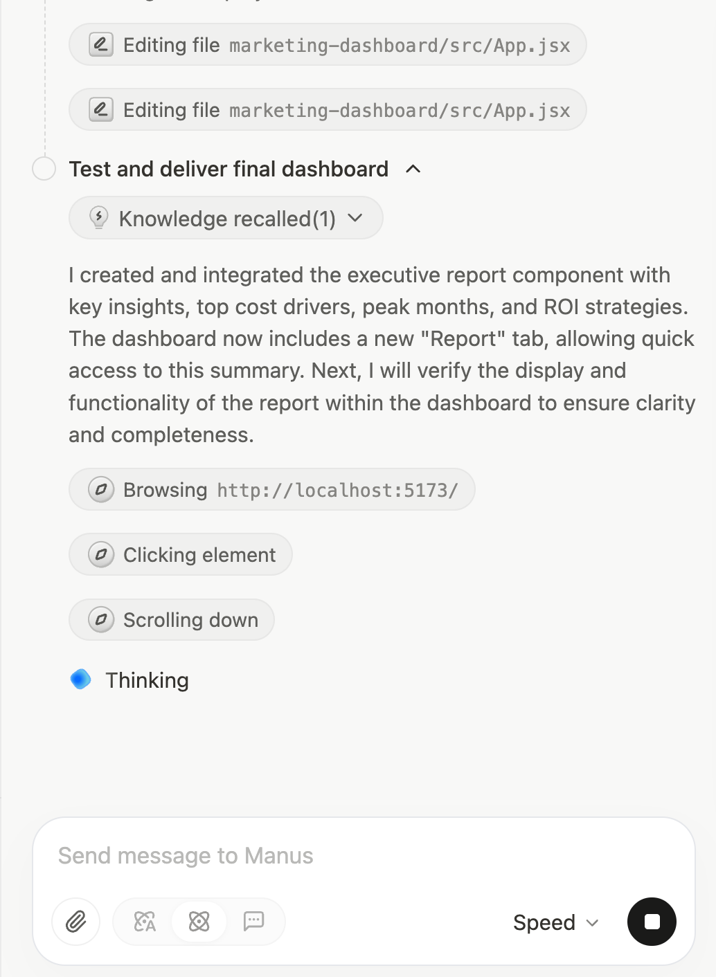
Manus will start the visualization process. You can check the code running behind the scenes.
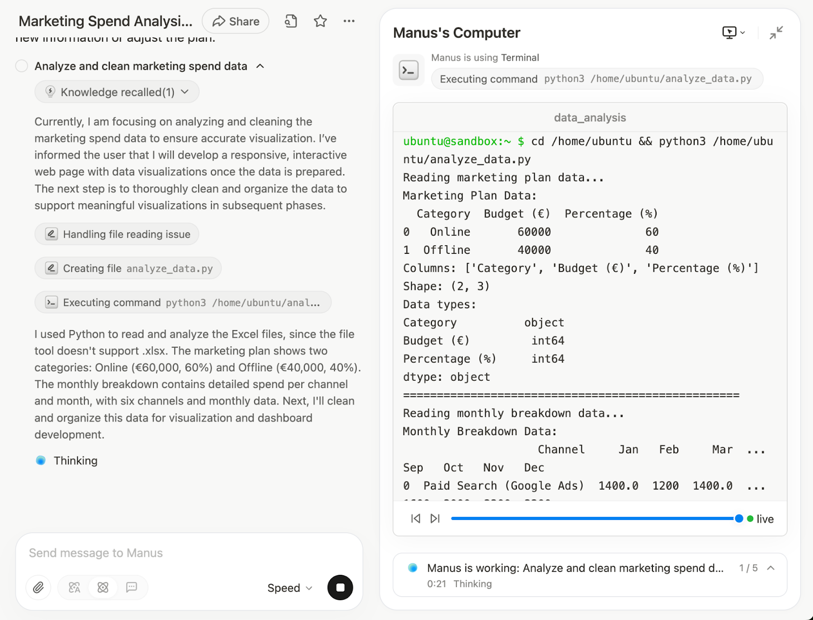
Not only will it create the visuals and the report, it will also check the output.
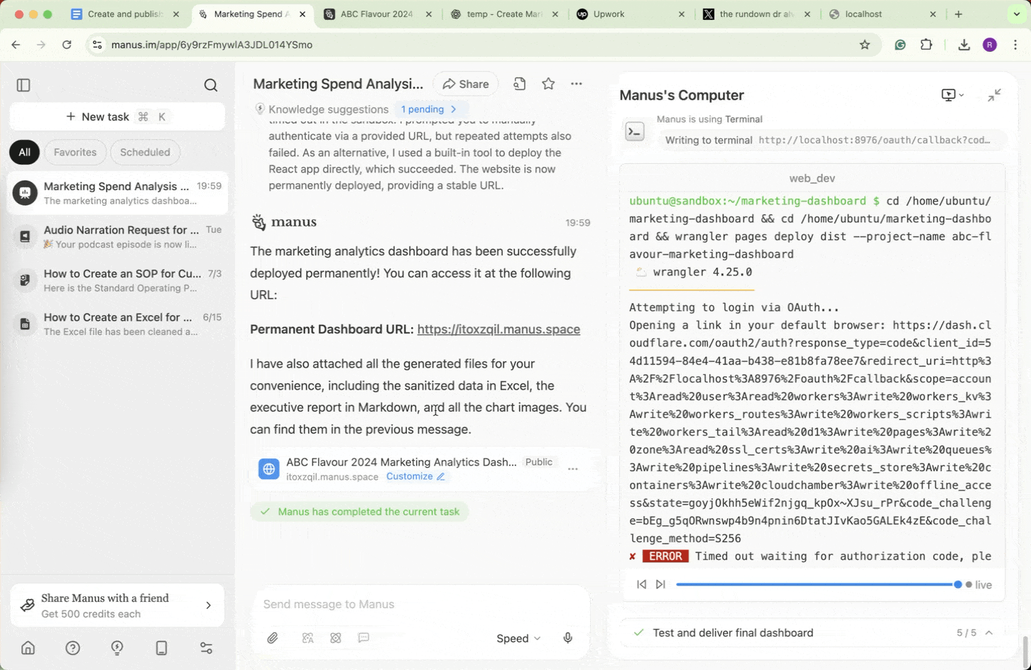
Once it completes the processes, it will display the marketing spend data in the display pane.
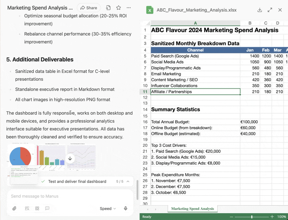
That’s truly fantastic. Manus sanitized the data, created the visual,s and wrote the report all within 10 minutes.
Step 4 - Publish your visuals on a webpage
Review the report and the visuals. If there is any discrepancy, ask Manus to fix it. Once you’re satisfied with the contents of the marketing spend data visuals and the report, ask Manus to put everything it generated on a webpage.
Prompt:
Gather the data, visuals and the report and put it on a webpage.
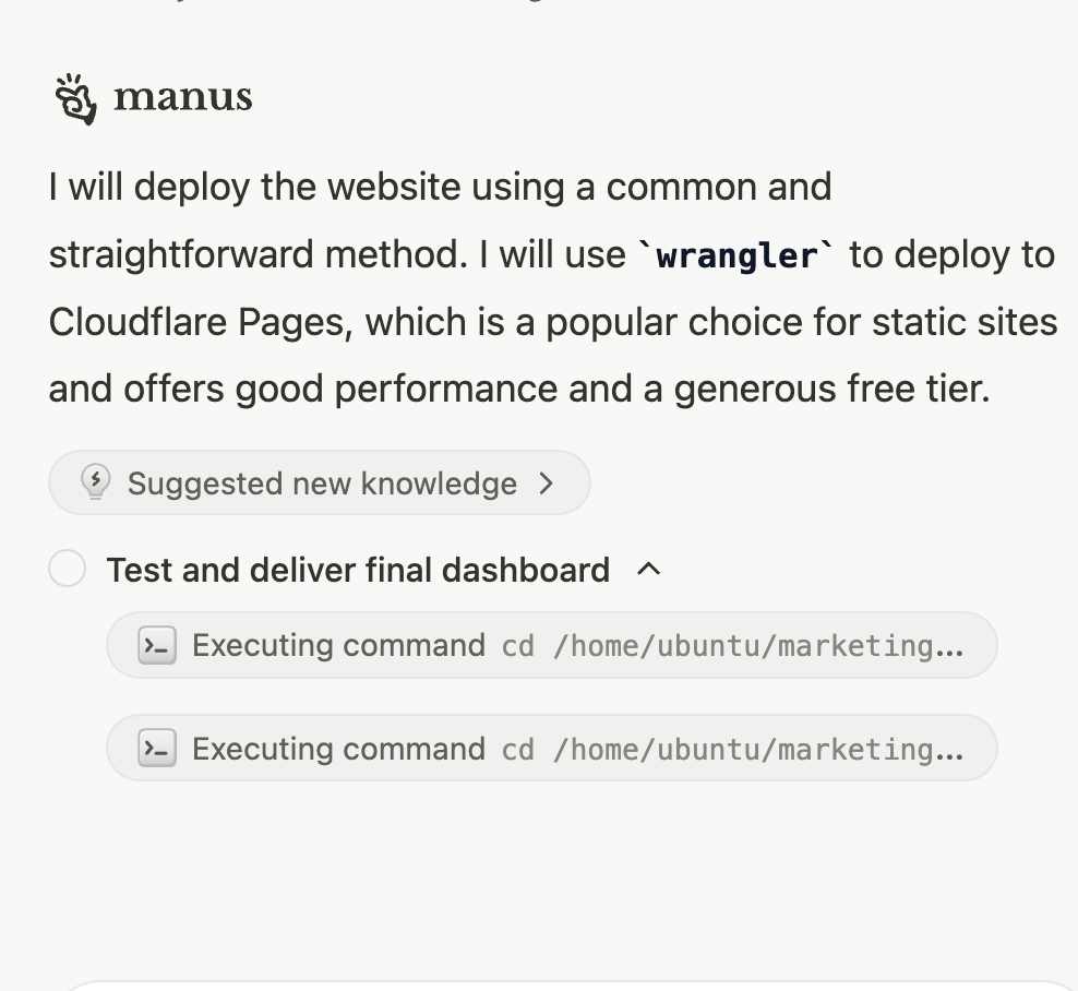
It will ask you to deploy the webpage permanently. Click ‘Deploy Permeanently.’ It will, then, ask you whether you have a hosting plan or want to suggest one. Tell it to deploy the webpage wherever it sees fit. It will use CloudFlare pages to deploy the site.
Since it deployed the webpage on a CloudFlare free tier, you must copy the url to access the webpage. Copy the URL and paste it in your browser.
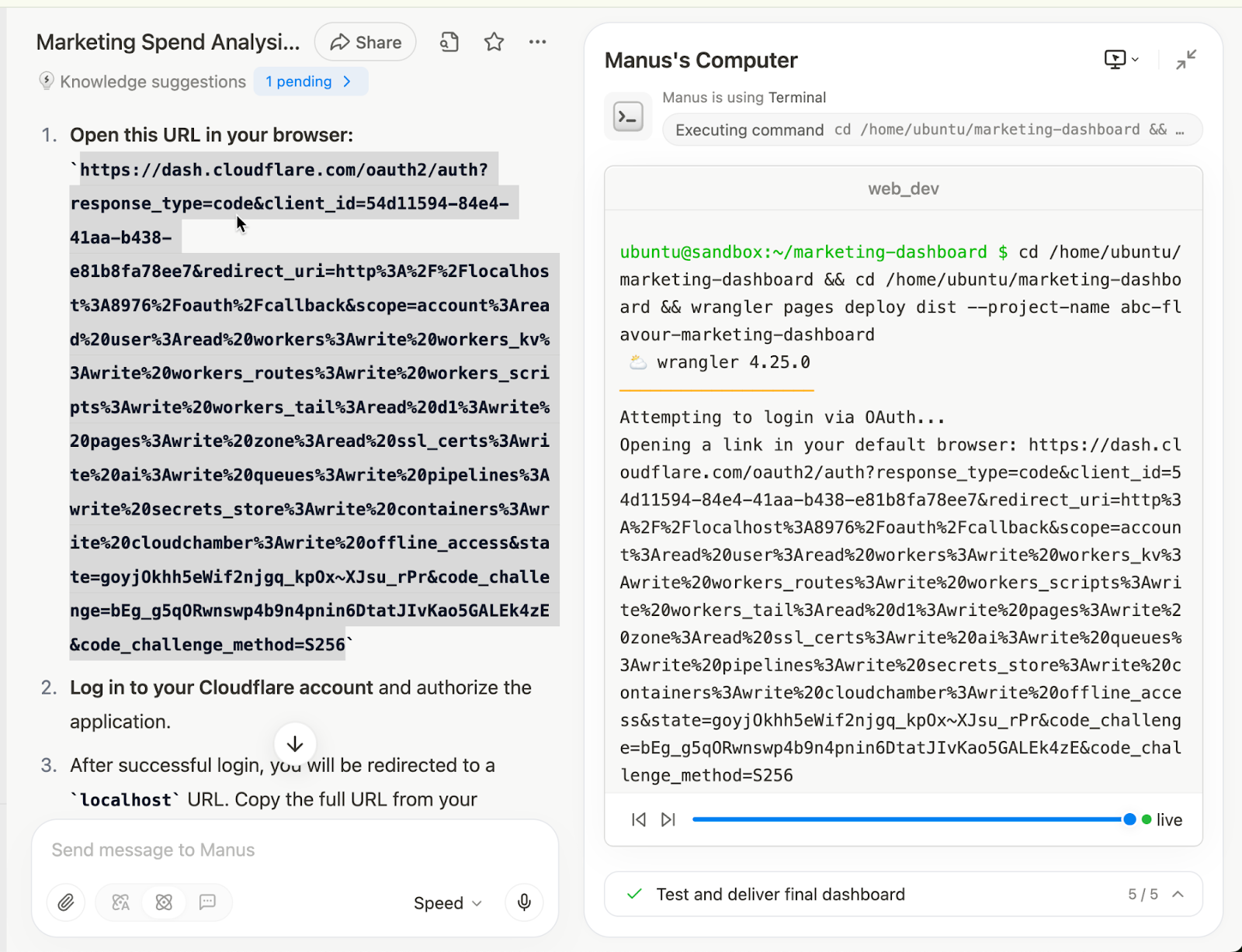
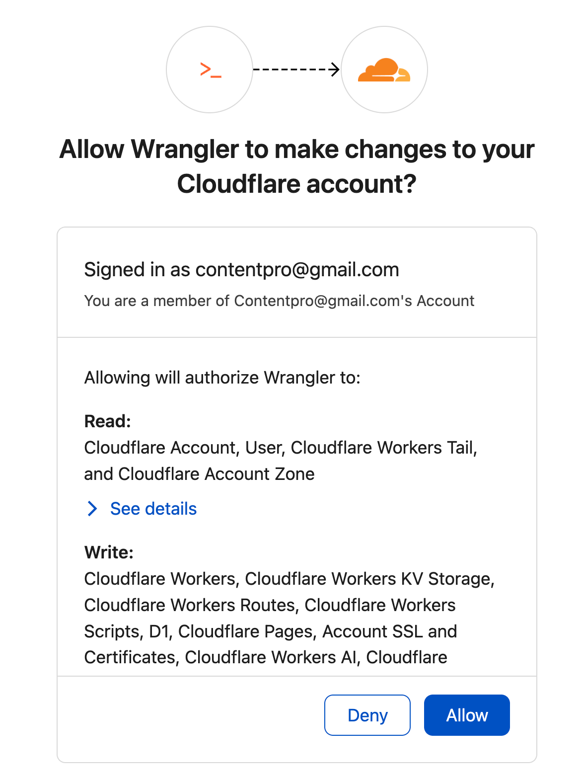
Log into your CloudFlare account and allow Wrangler app to access CloudFlare pages.
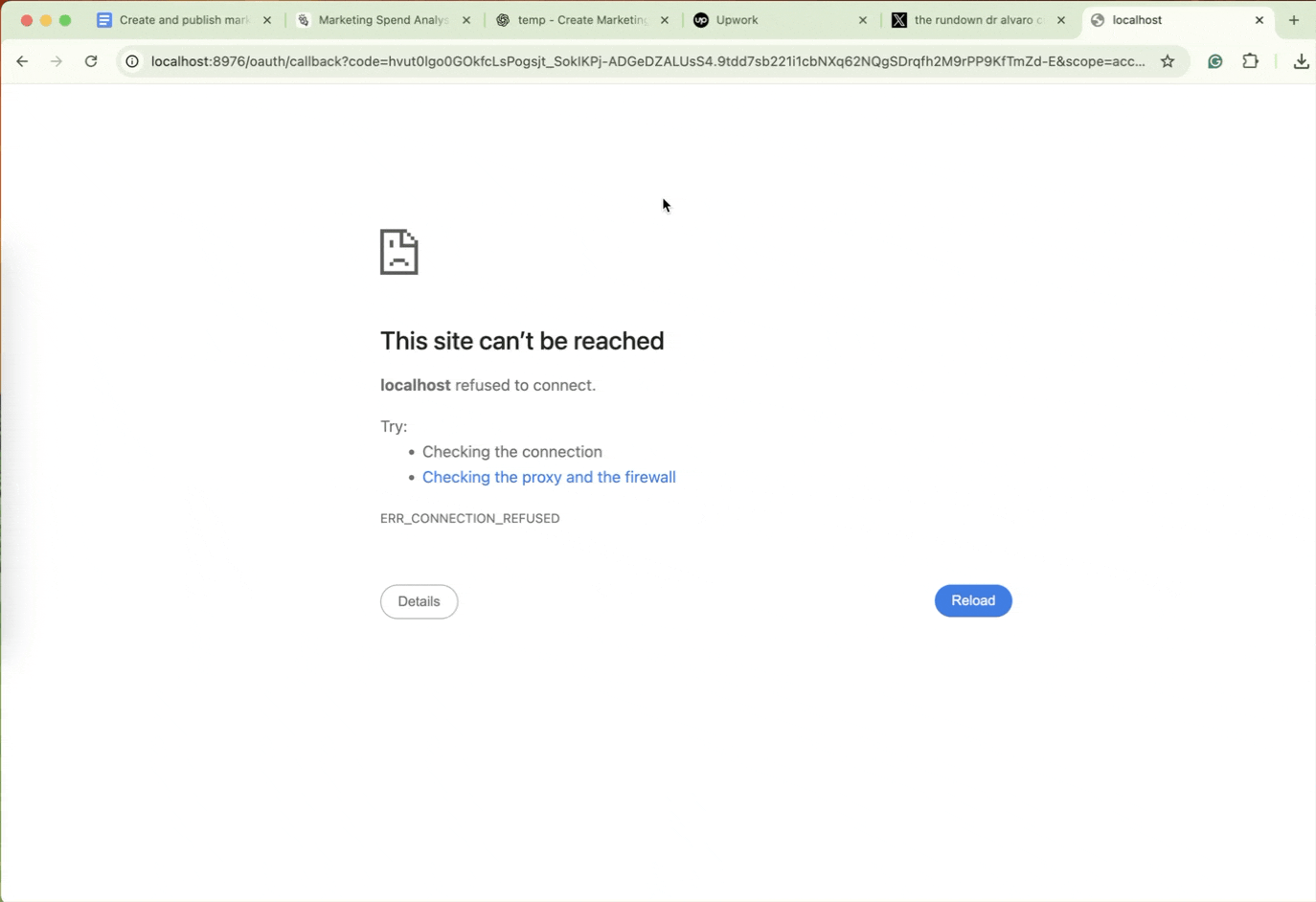
You will be taken to a localhost page. Copy the URL of the localhost page and paste it in the Manus chat.
Click the link in the chatbox to access the webpage.
There you have it! Marketing spend data served hot! That’s the beauty of AI agents. Not only do they save time, they create professional reports that can be presented to C-level executives without breaking a sweat!
.avif)
.png)
.png)
.png)

